Cover Girl
by allthebest • 6 May ’13 • profile • 12 Comments
 When I started working on Designers at Home in September 2011 I had no idea how long it would take to write such a book, much less the exacting details of every decision. No question it’s a long and wonderfully laborious process; and what a process it was. There are so many things to consider: selecting the ideal graphic designer, choice of type font, size (did you know that a book is composed of 16-page signatures so the page count must be divisible by 16?) and then there is nailing the book’s title and cover image! We must have looked at 20+ options before Rizzoli made the final selection. Thank goodness I was guided by my amazing editor Sandy Gilbert and book designer extraordinaire Doug Turshen every step of the way.
Last week, over lunch, Sandy, myself and Bradley Clifford were talking about all of the images I sorted through and thought it would be fun for me to do a series of blog posts on the book’s outtakes (i.e. the many things—both designers’ notes and imagery that did not make it into the book SOLEY due to page constraints). I perviously had the same conversation with Scot Meacham Wood…sort of a look at the making of a book. But first, here is a sampling of cover shots that were up for consideration. Enjoy!

The Home of Barry Dixon

The Home of Malcolm James Kutner
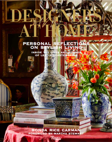
The Home of Michelle Nussbaumer

The Home of Colette van den Thillart

The Home of Colette van den Thillart
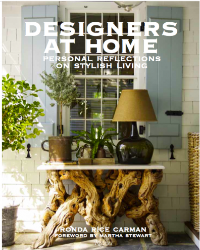
The Home of Steven Gambrel
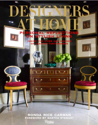
The Home of Philip Gorrivan
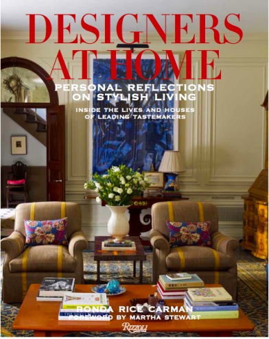
The Home of Katie Ridder and Peter Pennoyer

The Home of Alex Papachristidis and Scott Nelson
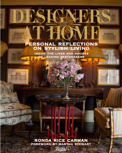
The Home of Michael Devine and Thomas Burak
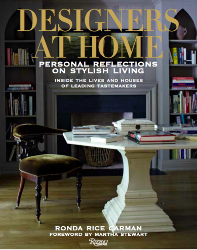
The Home of Colette van den Thillart

The Home of Barry Dixon

The Home of Mary McDonald
COVER IMAGE: Home of Robert Passal

Love this Ronda. As a former photographer one of the challenges was always the editing…especially when there were so many good ones to choose from. I think all of the above were great cover choices so I can’t even imagine how you ever made the final choice.
It was insane!! Glad I had help!
I love the cover selected and can’t wait to see the book in full! Congrats!
Congratulations on your labor of love, thanks for sharing the exciting process, can’t wait to stock your book on the shelves at VICTORY!
Can’t wait to get my copy!
They’re all wonderful, but I love the choice that was made! Very soothing and neutral to sit on anyone’s nightstand or coffee table! Such a beautiful job! XO!
Wow, what a choice. And they are all amazingly beautiful! Thanks for sharing behind the scenes of the tough decisions that go into birthing a book. And congrats on a second printing. The book is amazing and speaks for itself….I am still reading and re-reading it! My new handbook.
LOVED this, Ronda! I’m drooling over these photos… I can’t imagine! Also loving the post about the process. So interesting and you never get the inside scoop like this! Love and miss you, A
I love this post –educational, plus it’s fun to guess whose home is shown before checking. Beautiful photography.
Mary
Oh my goodness! That was indeed a process! All the covers considered looked great, but I think you ended up with the perfect choice. I’m ready to get my hands on your book. I’ll be heading to the Houston Design Center this week. See you there!
looks like one worth reading book, thanks for your interior design ideas sharing!
Pingback: What nourishes your soul? | Sacred Sensual Living